Bar plot
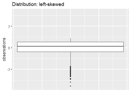
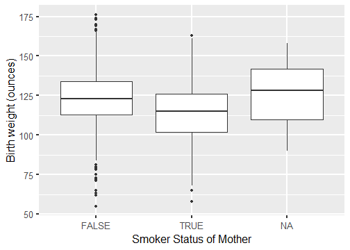
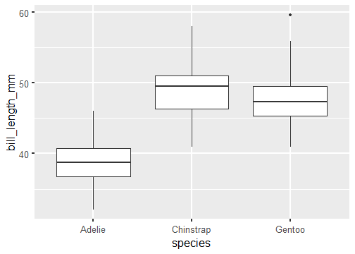
Box plot
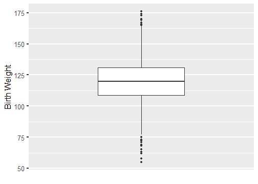
- The horizontal line inside the box represents the median.
- The box itself represents the middle 50% of the data with Q3 on the upper end and Q1 on the lower end.
- Whiskers extend from the box. They can extend up to 1.5 IQR away from the box (i.e. away from Q1 and Q3).
- The points are potential outliers that represent babies with really low or high birth weight.
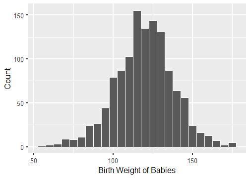
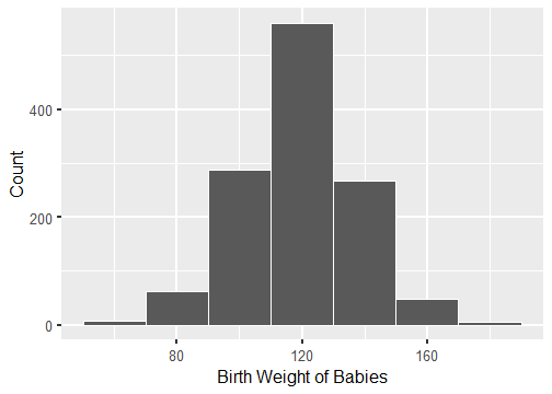
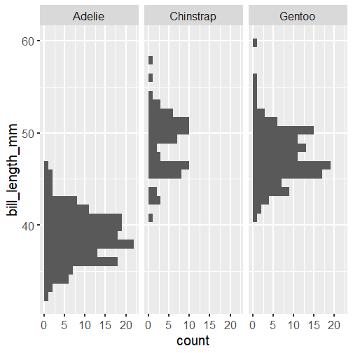
Histogram
Bin width = 5 ounces
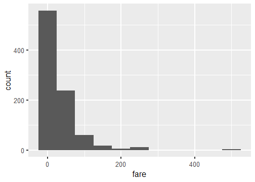
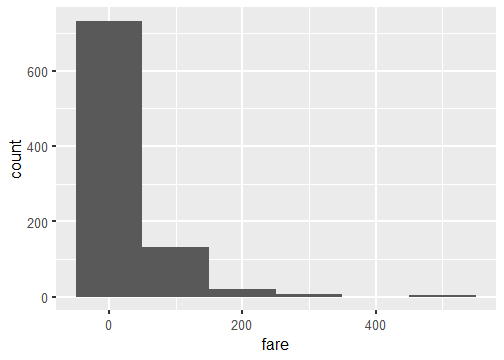
Bin width = 20 ounces
Histogram vs. Boxplot
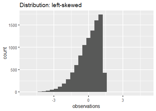
Tail tells the tale.

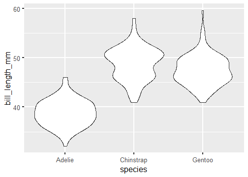
Note: Violin plots display densities, not counts!
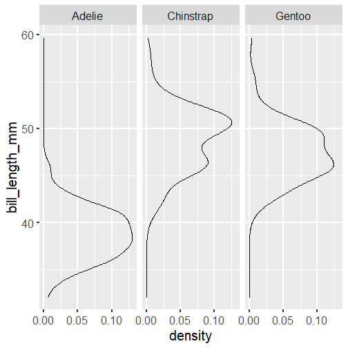
Note: Violin plots display densities, not counts!
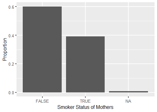
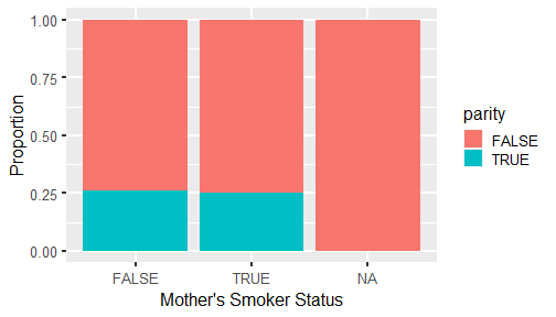
Standardized Bar Plot
Dodged Bar Plot
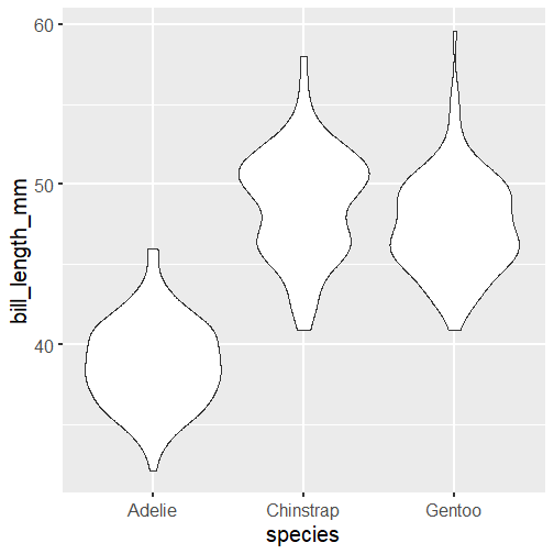
Side-by-side box plots
Scatter plots
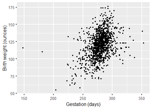
Length of gestation can possibly eXplain a baby's birth weight. Gestation is the eXplanatory variable and is shown on the x-axis. Birth weight is the response variable and is shown on the y-axis.
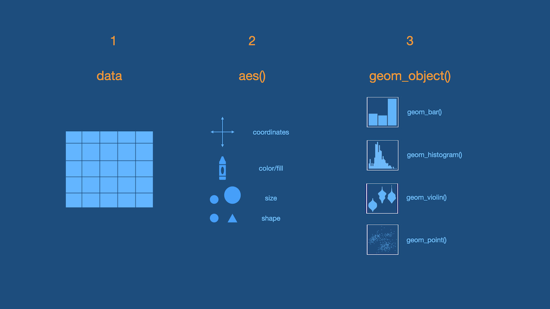
ggplot is based on grammar of graphics.
Step 1 - Pick Data
ggplot(data = titanic)
Step 2 - Map Data to Aesthetics
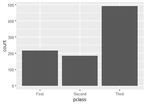
ggplot(data = titanic, aes(x = pclass))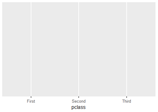
Step 3 - Add the Geometric Layer
ggplot(data = titanic, aes(x = pclass)) + geom_bar()

Step 1 - Pick Data
ggplot(data = titanic)
Step 2 - Map Data to Aesthetics
ggplot(data = titanic, aes(x = fare))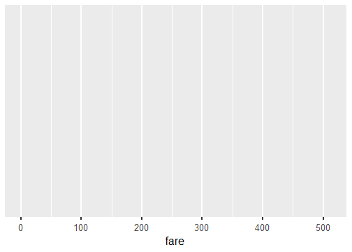
Step 3 - Add the Geometric Layer
ggplot(data = titanic, aes(x = fare)) + geom_histogram()`stat_bin()` using `bins = 30`. Pick better value with `binwidth`.
What is this warning?
`stat_bin()` using `bins = 30`. Pick better value with `binwidth`.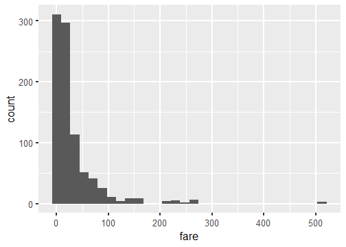
ggplot(data = titanic, aes(x = fare)) + geom_histogram(binwidth = 15)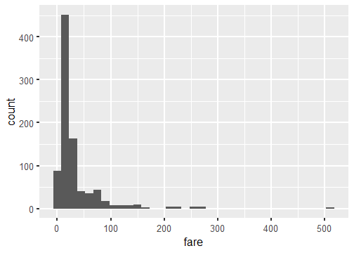

ggplot(data = titanic, aes(x = fare)) + geom_histogram(binwidth = 15, color = "white")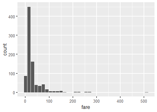
ggplot(data = titanic, aes(x = fare)) + geom_histogram(binwidth = 15, fill = "darkred")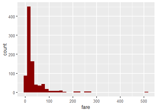
ggplot(data = titanic, aes(x = fare)) + geom_histogram(binwidth = 15, color = "white", fill = "darkred")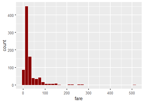
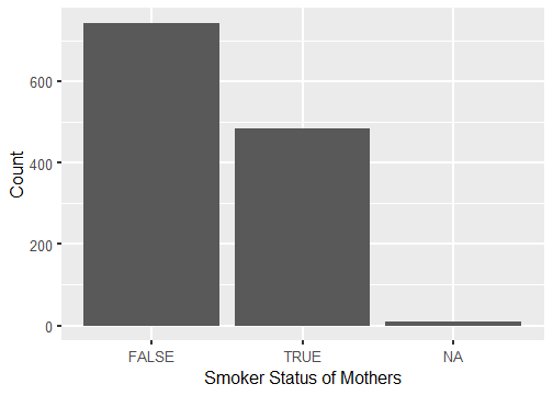
Stacked Bar-Plot
ggplot(data = titanic, aes(x = pclass, fill = survived)) + geom_bar()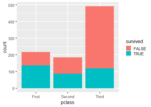
Standardized Bar Plot
ggplot(data = titanic, aes(x = pclass, fill = survived)) + geom_bar(position = "fill")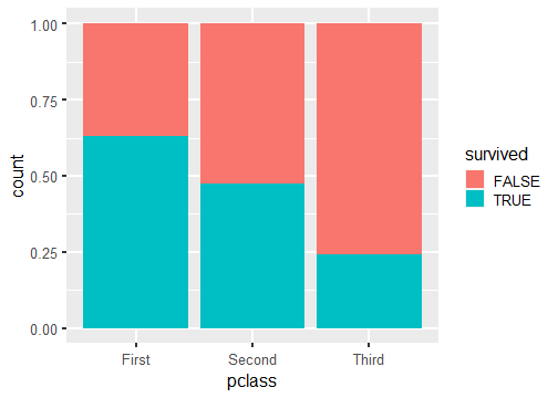
Note that y-axis is no longer count but we will learn how to change that later.
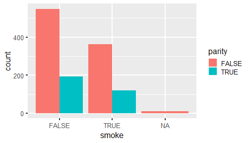
Dodged Bar Plot
ggplot(data = titanic, aes(x = pclass, fill = survived)) + geom_bar(position = "dodge")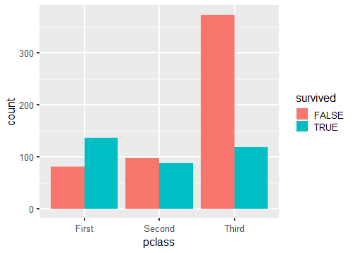
Note that y-axis is no longer count but we will change that later.
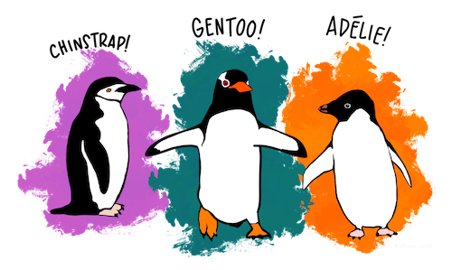
Artwork by @allison_horst
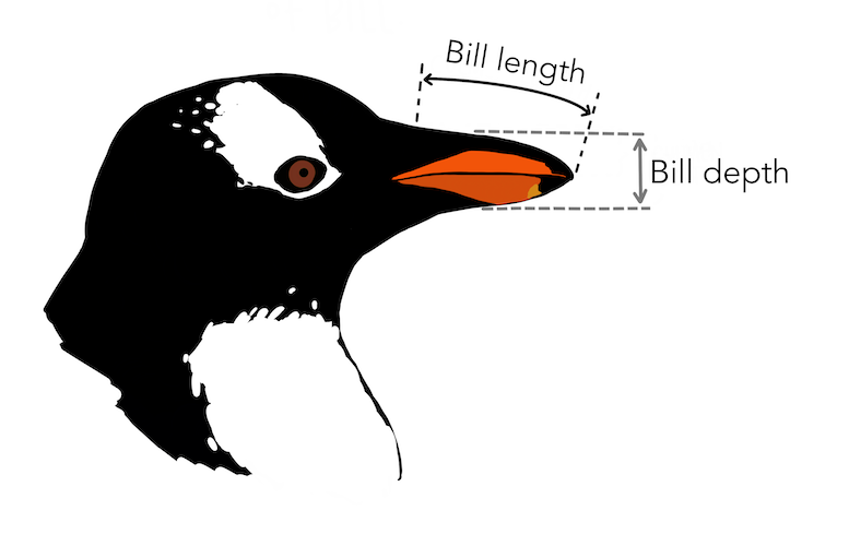
ggplot(penguins, aes(x = bill_depth_mm, y = bill_length_mm)) + geom_point()Warning: Removed 2 rows containing missing values (geom_point).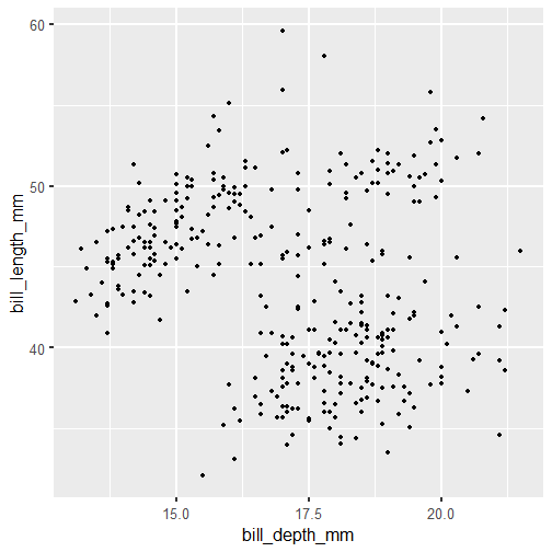
Linear Relationship
ggplot(babies, aes(x = gestation, y = bwt)) + geom_point() + geom_smooth(method = "lm", se = FALSE)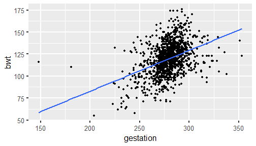
ggplot(penguins, aes(x = bill_depth_mm, y = bill_length_mm, color = species)) + geom_point()Warning: Removed 2 rows containing missing values (geom_point).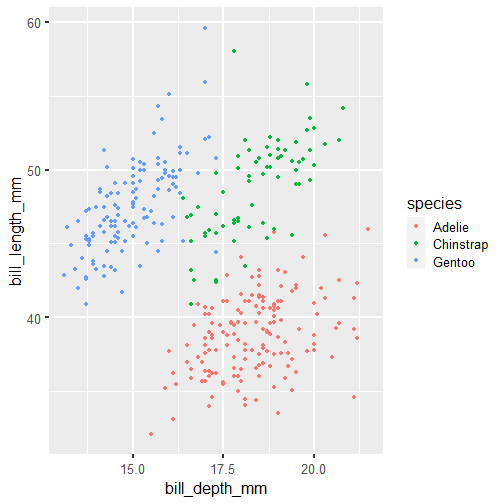
ggplot(penguins, aes(x = bill_depth_mm, y = bill_length_mm, shape = species)) + geom_point()Warning: Removed 2 rows containing missing values (geom_point).
ggplot(penguins, aes(x = bill_depth_mm, y = bill_length_mm, shape = species)) + geom_point()Warning: Removed 2 rows containing missing values (geom_point).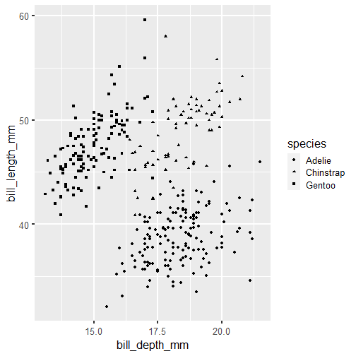
ggplot(penguins, aes(x = bill_depth_mm, y = bill_length_mm, shape = species, color = species)) + geom_point()Warning: Removed 2 rows containing missing values (geom_point).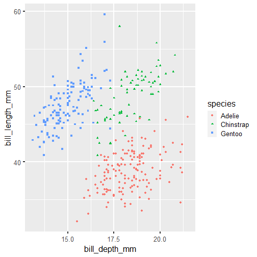
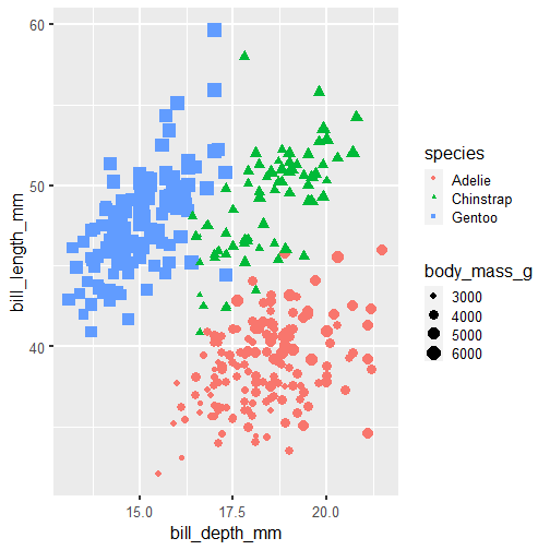
ggplot(penguins, aes(x = bill_depth_mm, y = bill_length_mm, shape = species, color = species, size = body_mass_g)) + geom_point()Warning: Removed 2 rows containing missing values (geom_point).